Legacy platform reimagined—from the ground, up
The problem: Navisphere, C.H. Robinson’s 20+ year-old legacy technology “platform,” is an amalgamation of various disparate individual products. This results in frustrating limitations and inconsistent or redundant experiences.
The solution: a fully reimagined, cloud-based, enterprise resource planning tool (ERP). My team and I created a modern, user-friendly way to manage the logistics quote to cash lifecycle. We started with the global navigation strategy, pattern library (including the innovative workspaces concept), and baseline design system.
Our users
My team and I wanted to create a holistic platform environment for C.H. Robinson employees (a variety of personas within themselves), their customers, and their carriers. The company has 15,000 employees in every continent but Antarctica, countless commercial accounts, and contractual relationships with over 66,000 transportation companies (including motor carriers, railroads, air freight, and ocean carriers).
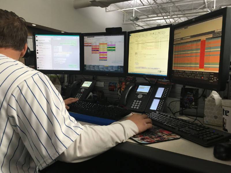
This is one of our internal power users. They use all four monitors and both desk phones throughout their day.
For the redesign of such a large system with a vast base of users, we chose to start with our own employee user base. Within that group of people, there are a variety of job roles, job families, and designated tasks.
Scope and constraints
This is an on-going, multi-year project. The current technology landscape was fraught with lost code bases and is evolving through major overhauls to bring products up to best practices. Our team was self-managed and afforded great freedom to innovate, however, we faced a lot of leadership changes and competing priorities.
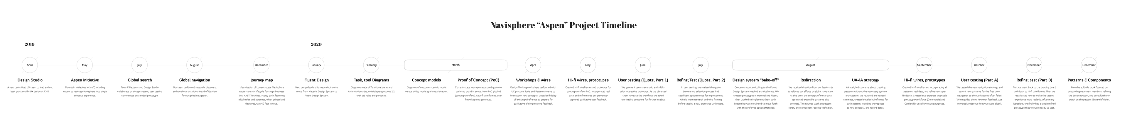
Project timeline
This is a multi-year project which started in April, 2019 and continues to today. This timeline is to represent the several redirections and phases the project took throughout my time on the team. (Select image to zoom in.)
My role
The team officially included myself and two other Senior UX Designers. We worked closely with a project manager and multiple teams of developers, enterprise architects, business partners, and leadership. My role included research, strategy, vision casting, user interviews, workshops, testing, information architecture, design, interactive prototyping, and design systems.
Systems research
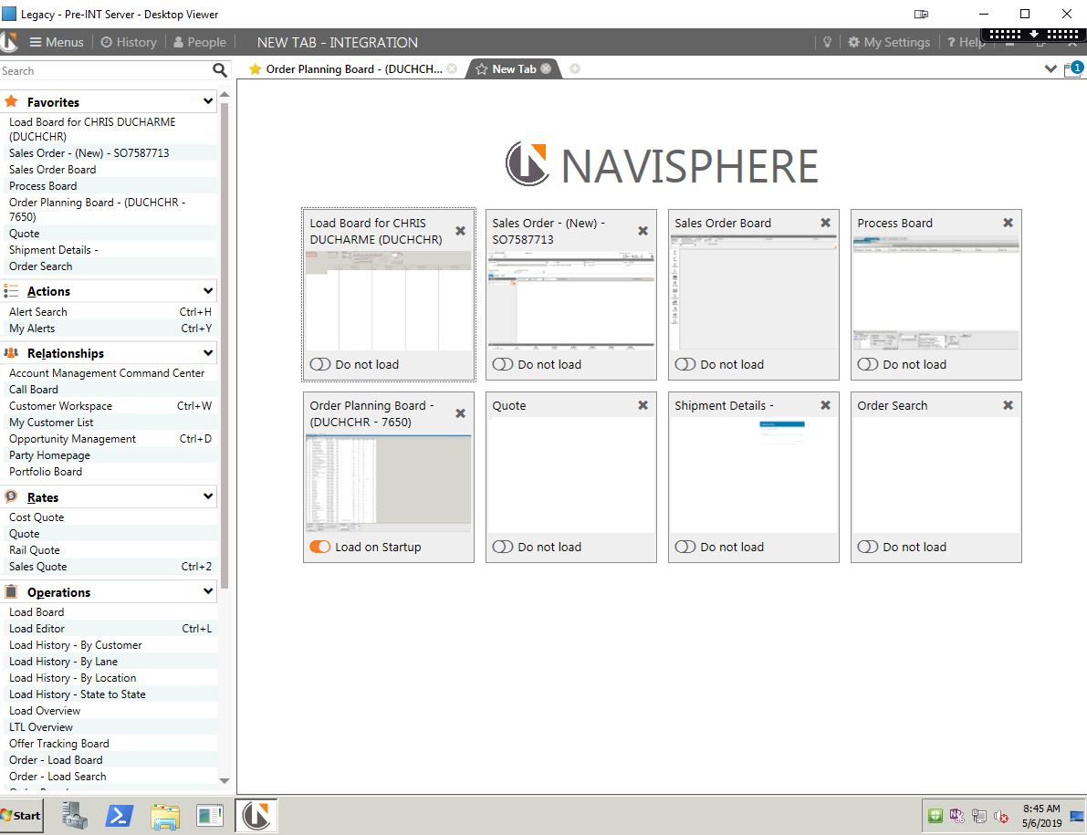
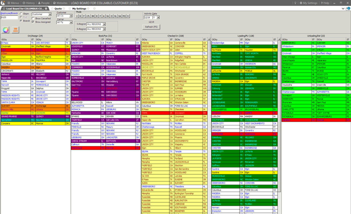
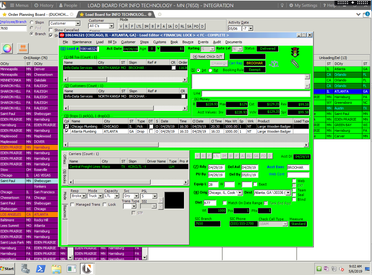
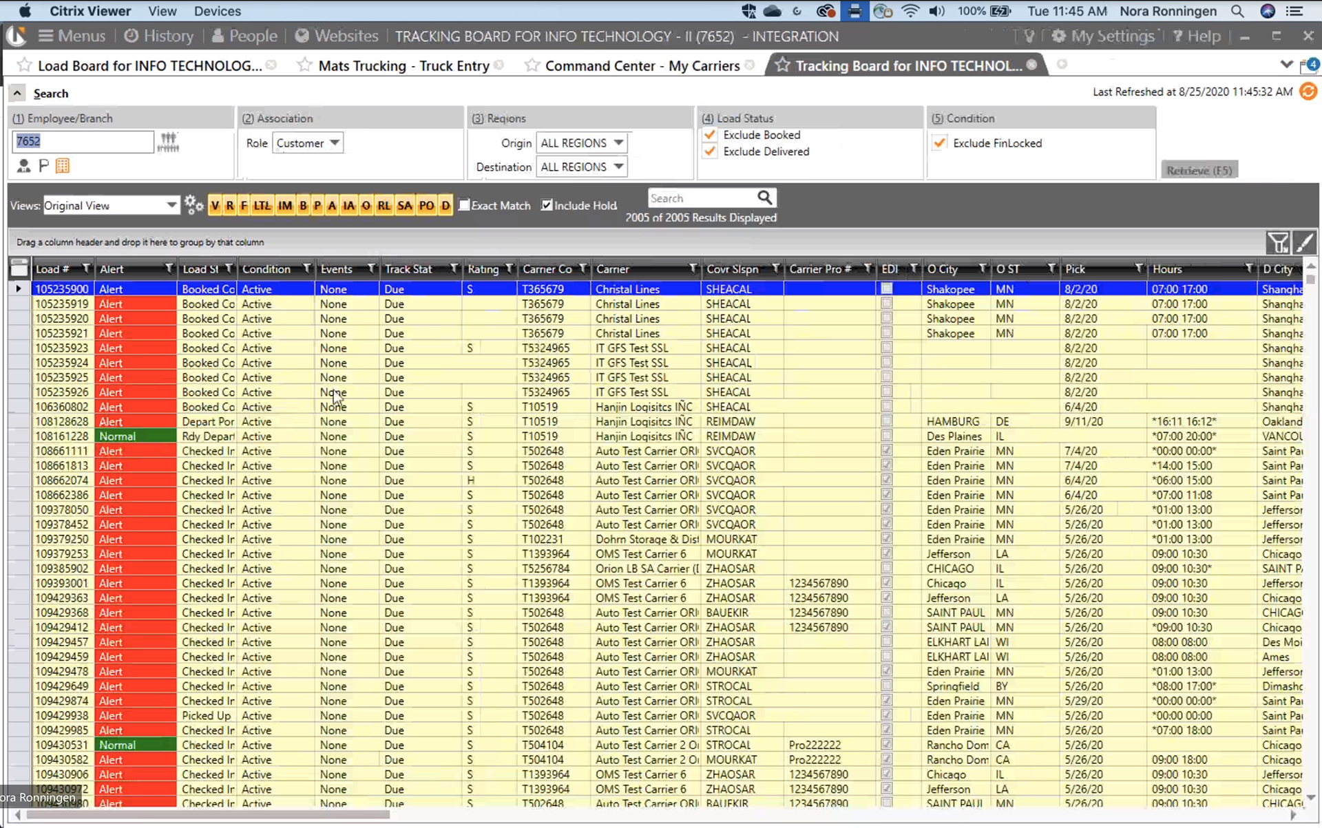
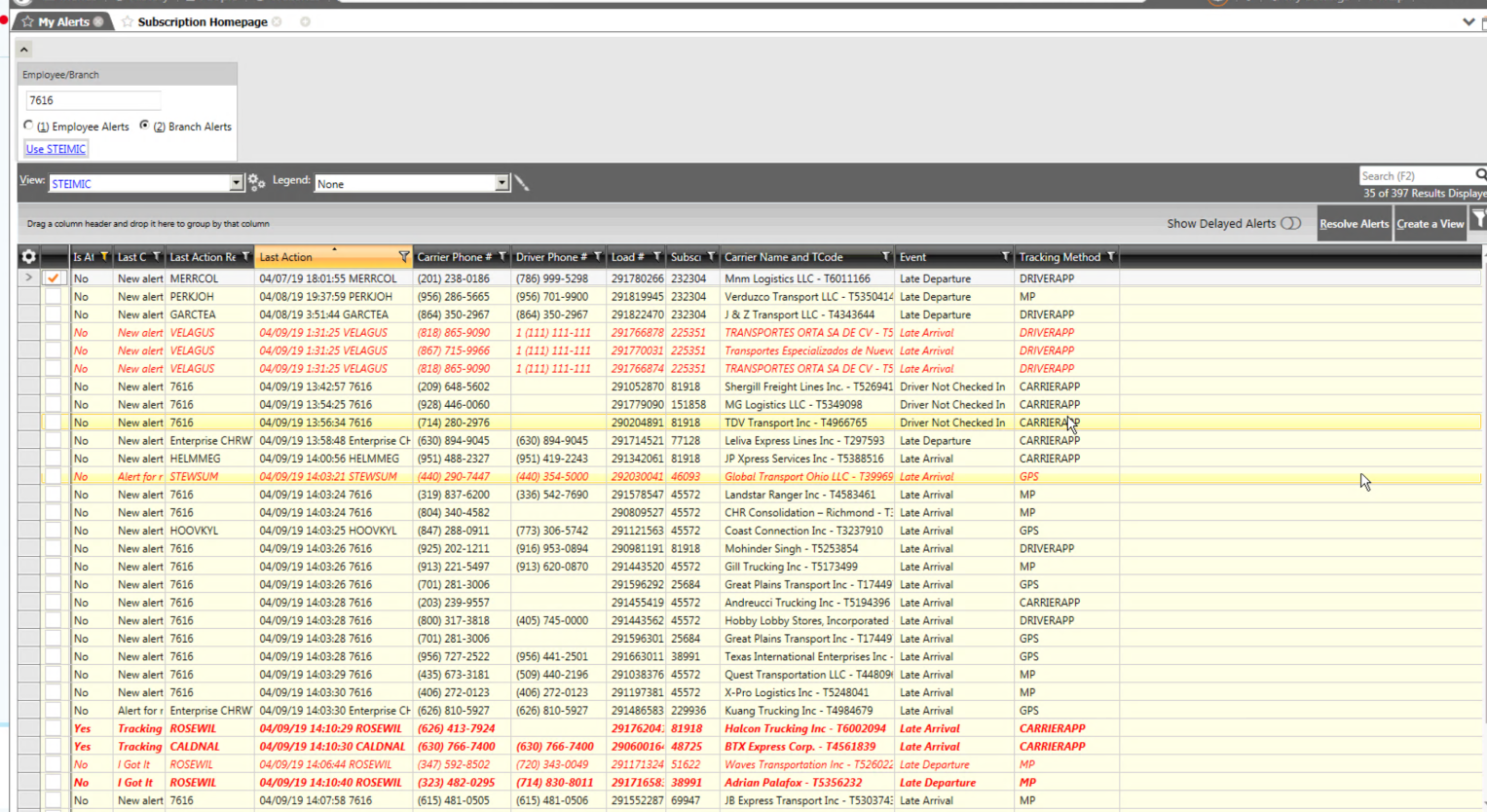
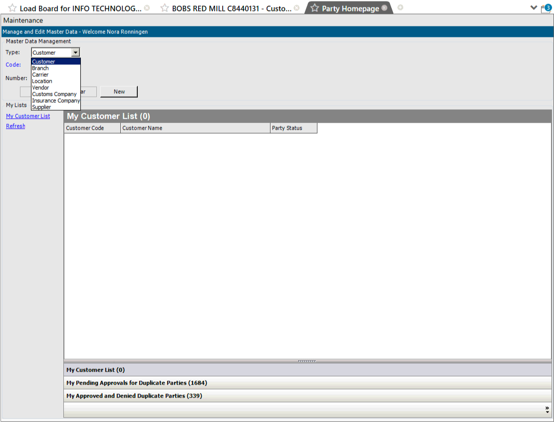
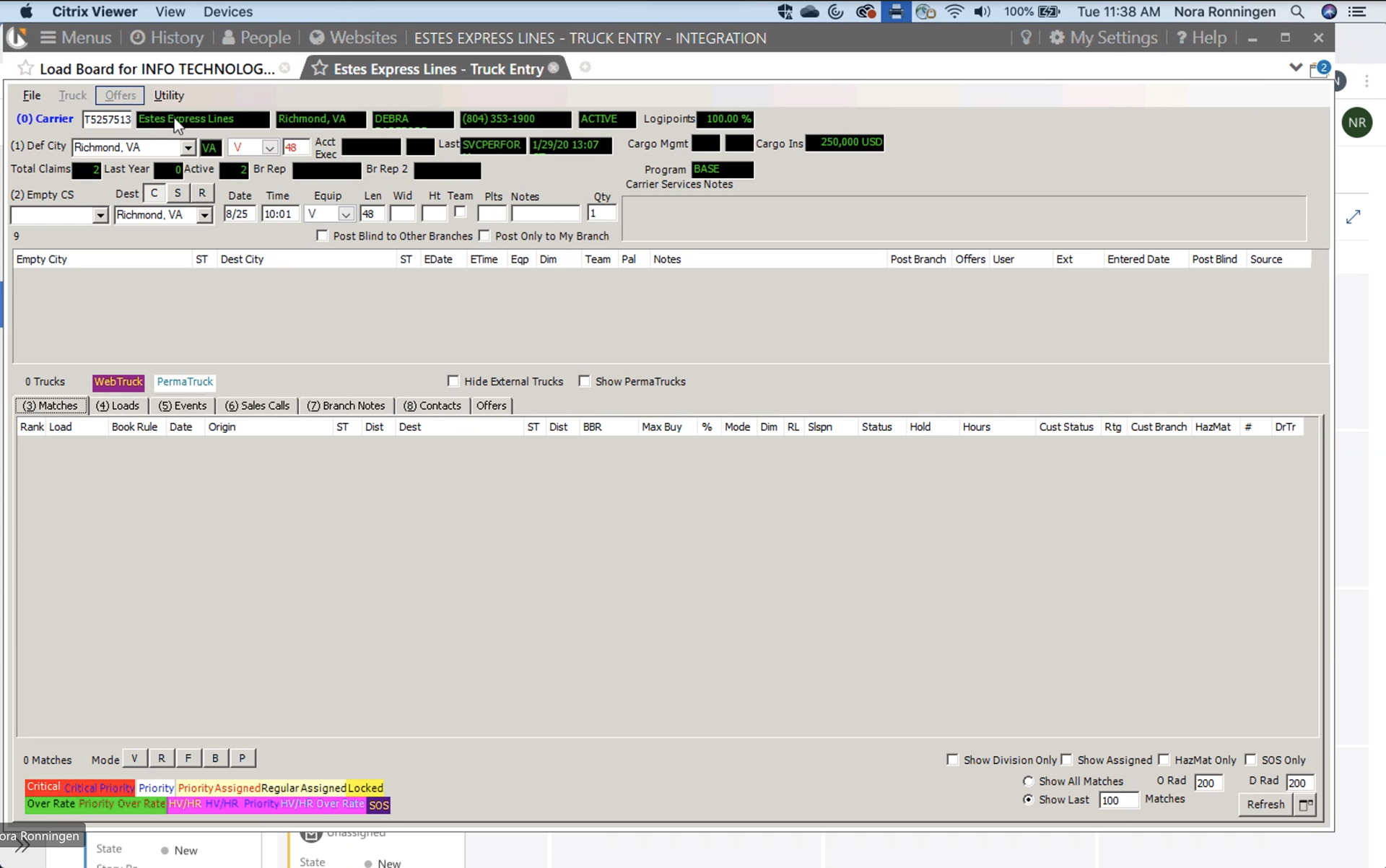
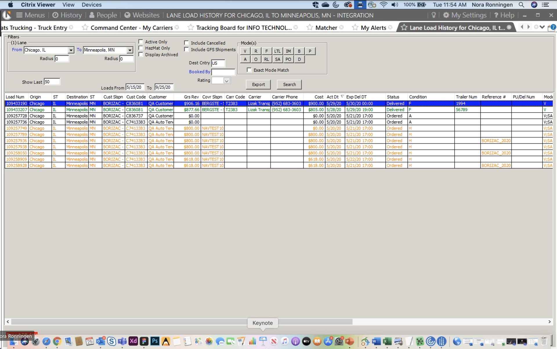
Current-state legacy system
Below are some examples of images captured during multiple legacy system research and ethnographic interview sessions. Throughout the project, my team and I would revisit these screens first-hand to increase our knowledge of the existing concept models, architecture, and user experience flow.
Competitive, comparative, and pattern analysis
These images show a the variety of competitive analysis that was completed on the project just prior to my joining the team. As a team, we updated this content throughout the project as new information came to light.
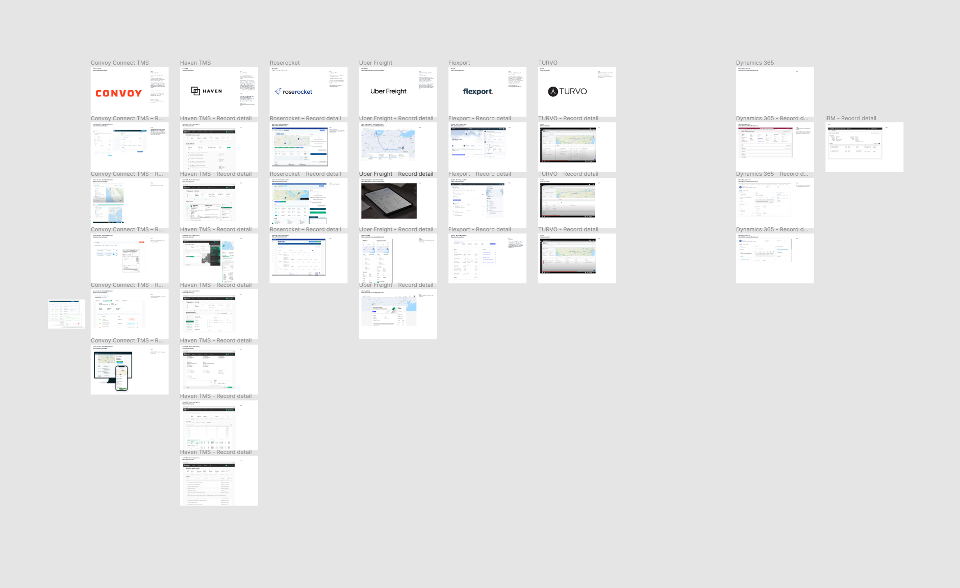
Competitive analysis
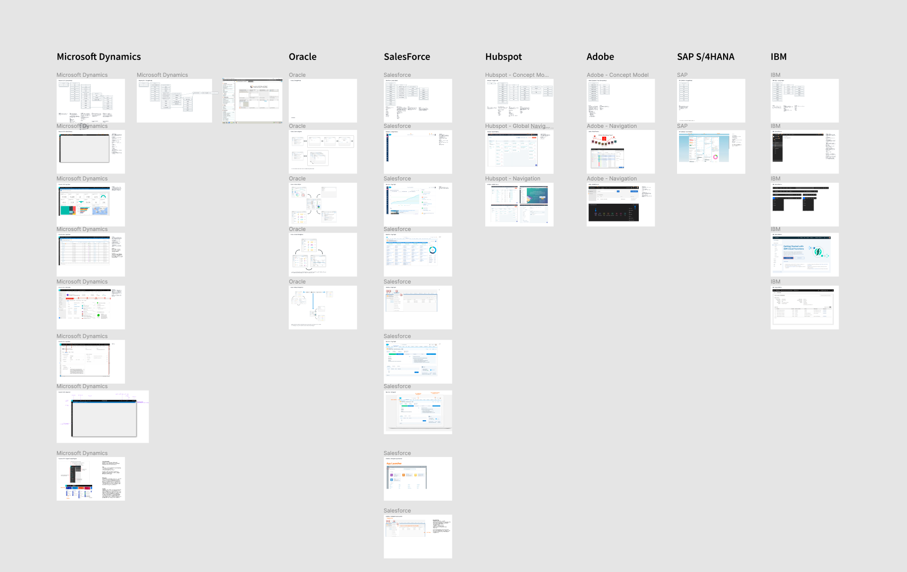
Comparative platform analysis
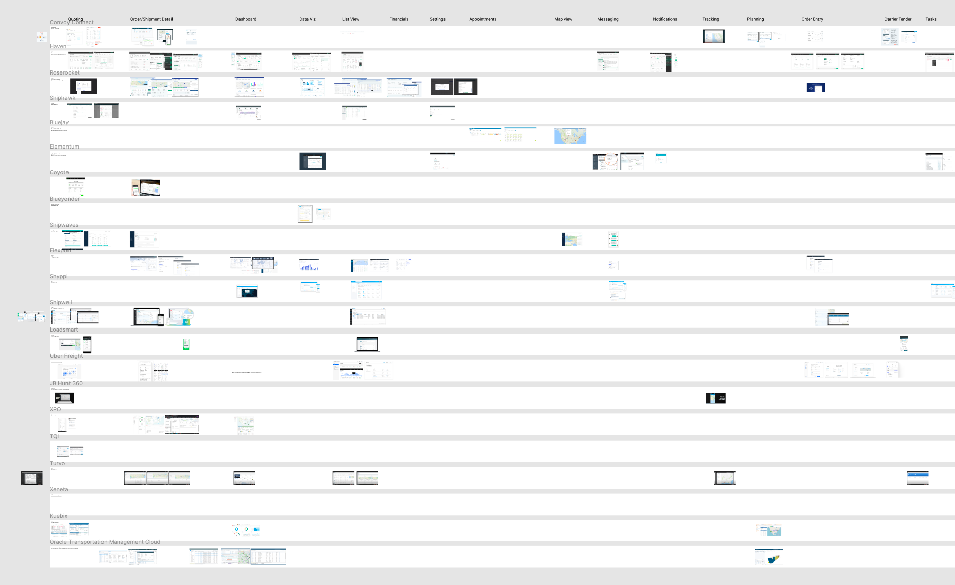
Comparative product pattern analysis
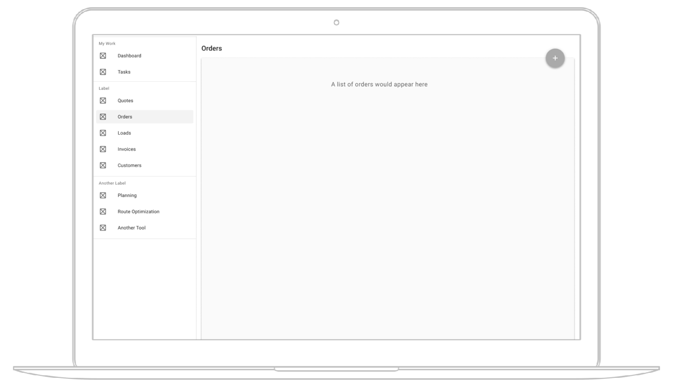
Initial global navigation concept
Prior to my joining the team, an initial concept for the system’s global navigation strategy was loosely defined. I was able to participate in testing this concept and found inspiration from the experience.
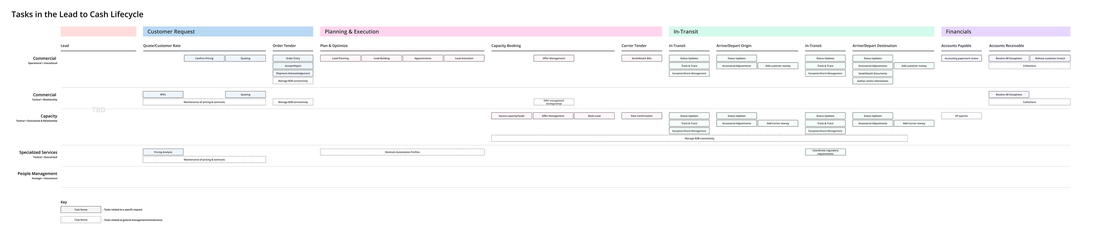
Lead-to-Cash Lifecycle diagram
My teammate created this diagram to document the repetitious lifecycle of logistics business. This starts from initial lead (primarily handled in Microsoft Dynamic) through to the "cash" or financials phase. As a team, we utilized this information in the journey mapping and other UX activities performed later in this project.
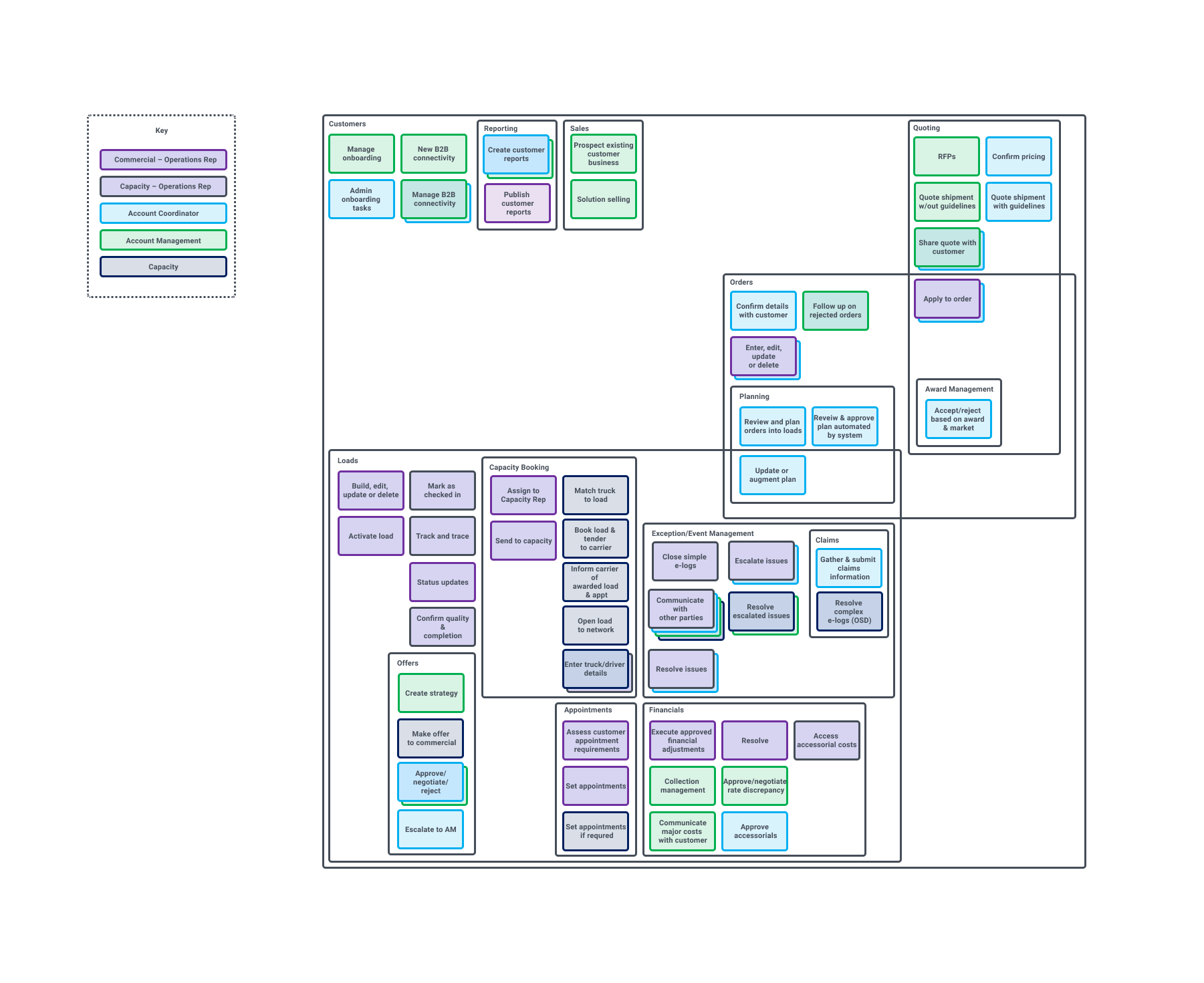
Current-state, end-to-end journey map
When a new UX Director began, we were tasked with mapping out the entire quote-to-cash (FKA "lead-to-cash") lifecycle. We needed a way to tell the story of just how complex C.H. Robinson business and the Navisphere technology itself is.
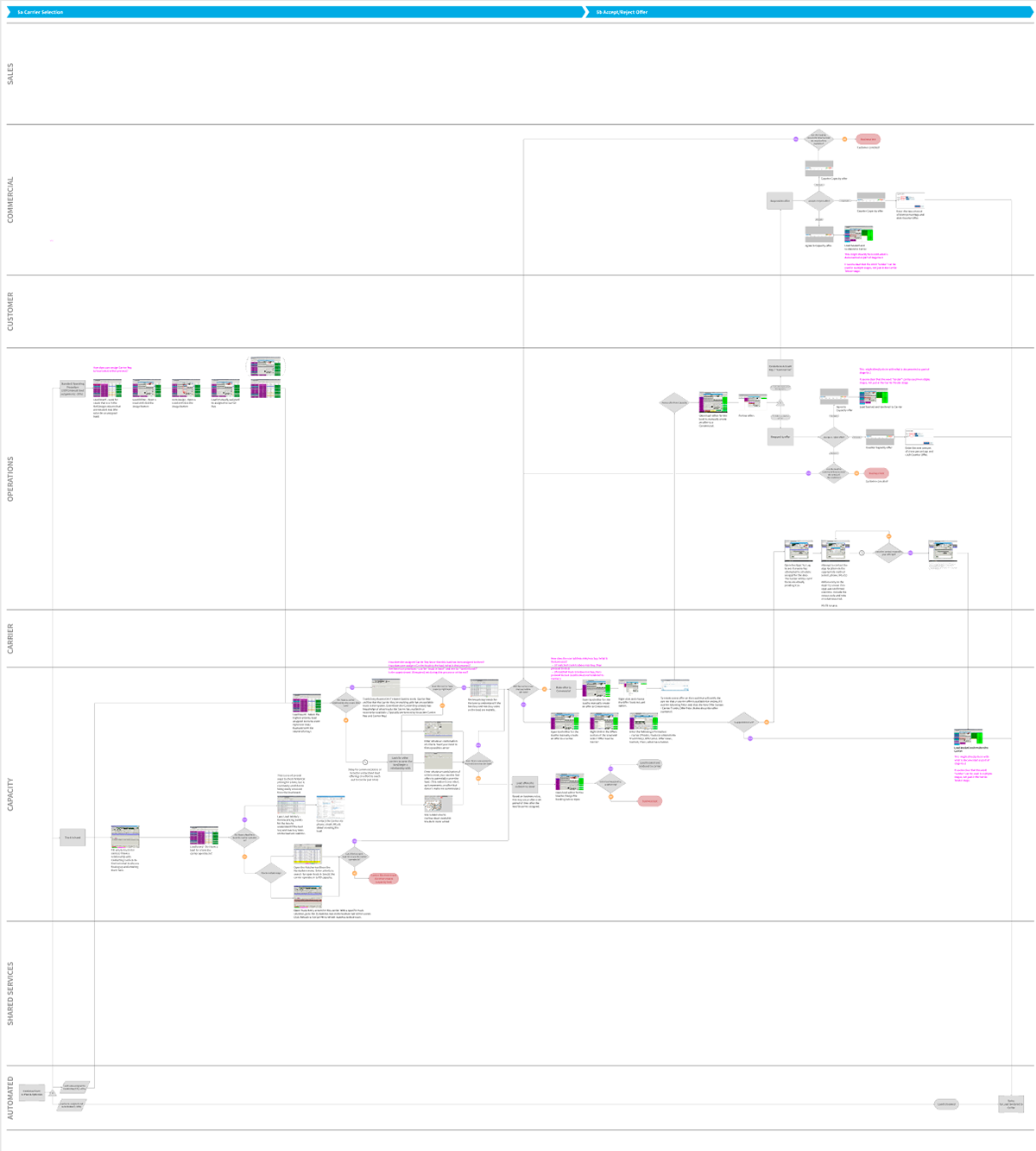
Capacity Booking
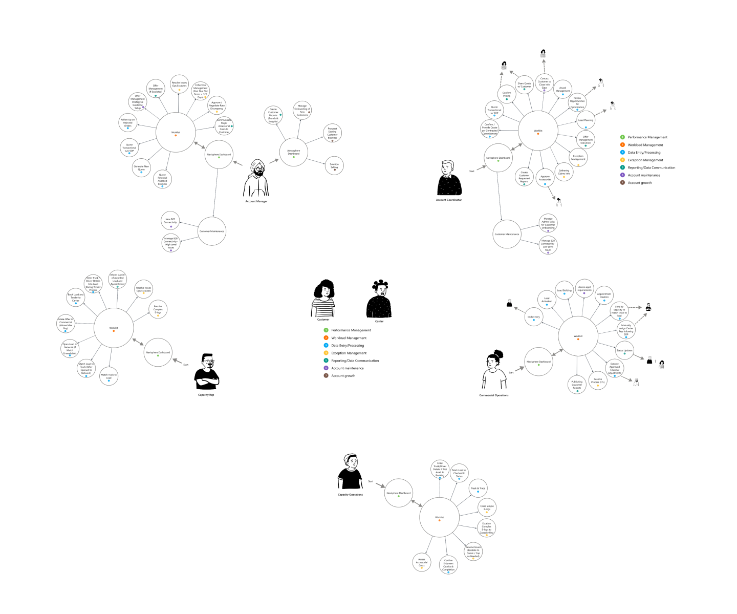
My team and I honed in on one of the five business lines, which is known as NAST (North American Surface Transportation), for a single service line (truckload), for the happy-path workflow. Below is a single step of the over all end-to-end journey map for the capacity booking phase, which I contributed the most to.
Printed journey map
Below is a photo I took of our finished, printed journey map. It totaled over forty feet in length.
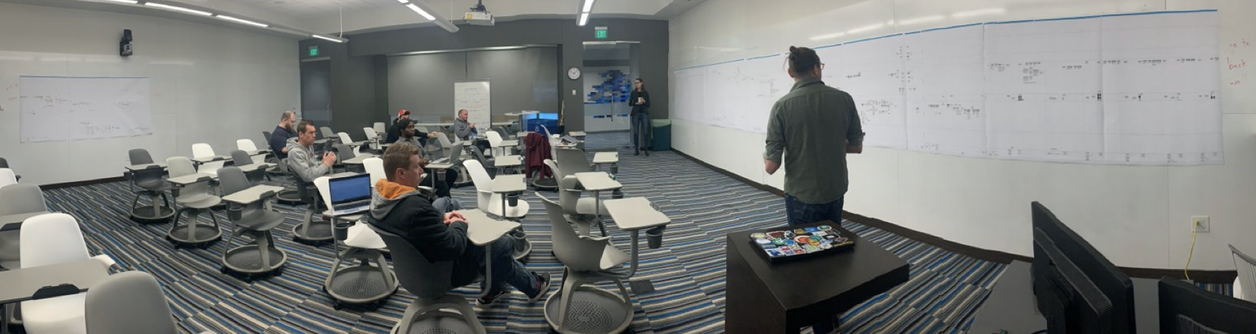
This marked the first time any legacy technology was journey mapped in the 120+ year history of the company.
Diagrams & concept models
Tool diagram
The left diagram explains how tasks fall in line to certain tools that had been slated to be found in the system and its global navigation. For my part, I took this and ran with it. I was inspired by what I saw as a tool-centric concept model that mis-matched with a very humanized, customer-centric user base.
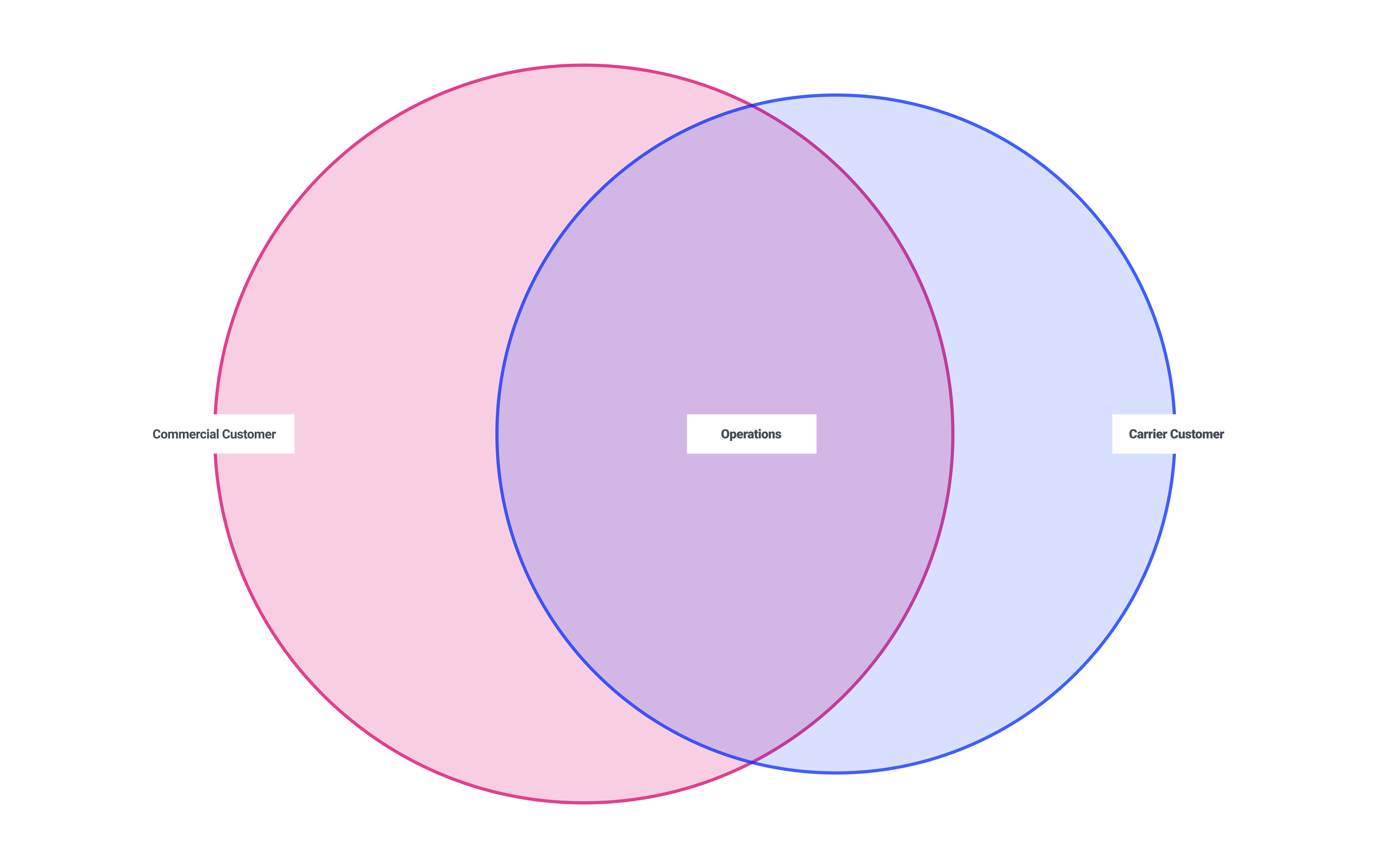
Concept model
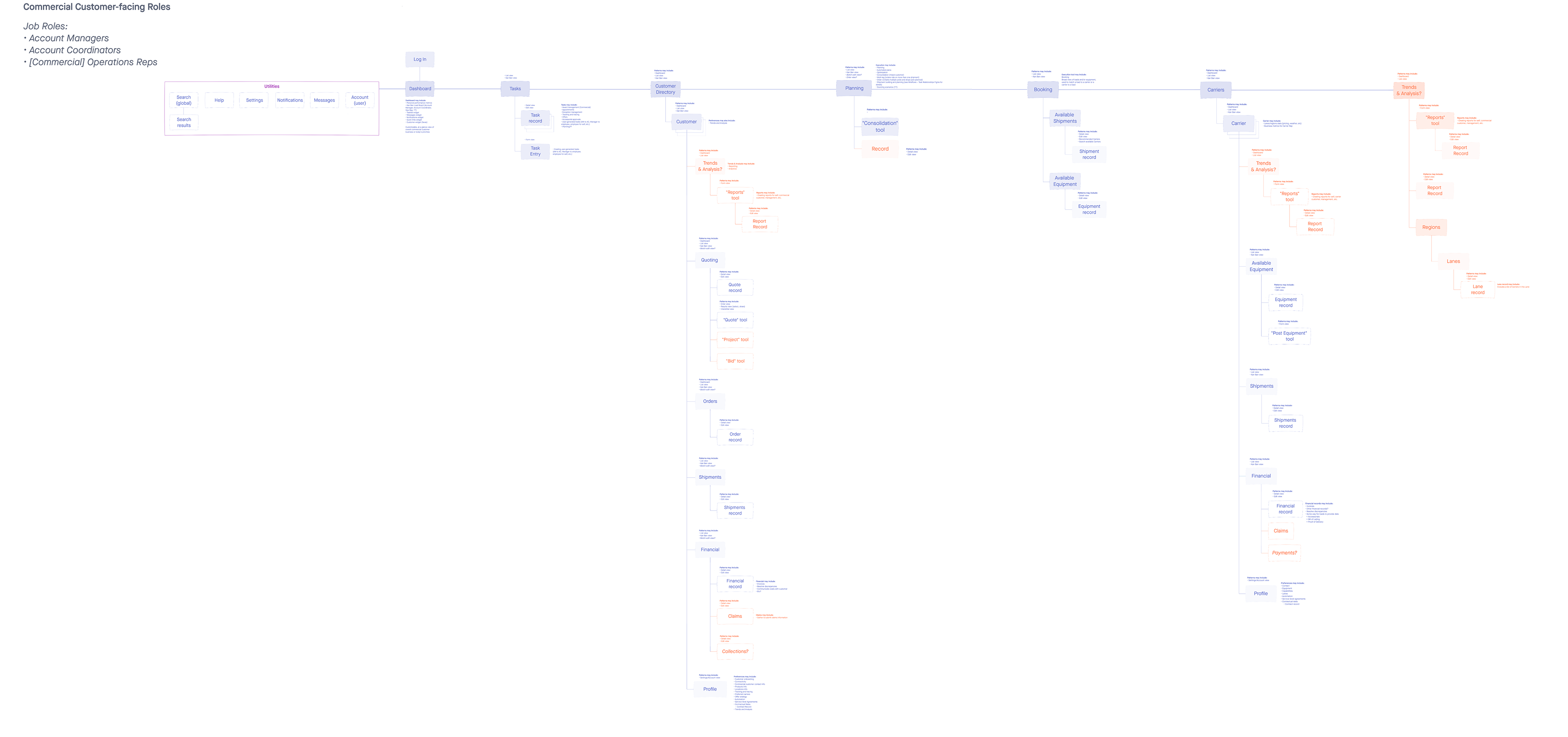
I created the simple diagram to the right to explain the mantle model I felt best suited our system, based on the needs of the people it serves. This could be divided into three main groups, commercial customers (who have goods to ship), carrier customers (who have modes of transport to offer) and the logistics in-between (such as booking, planning, and exception management).
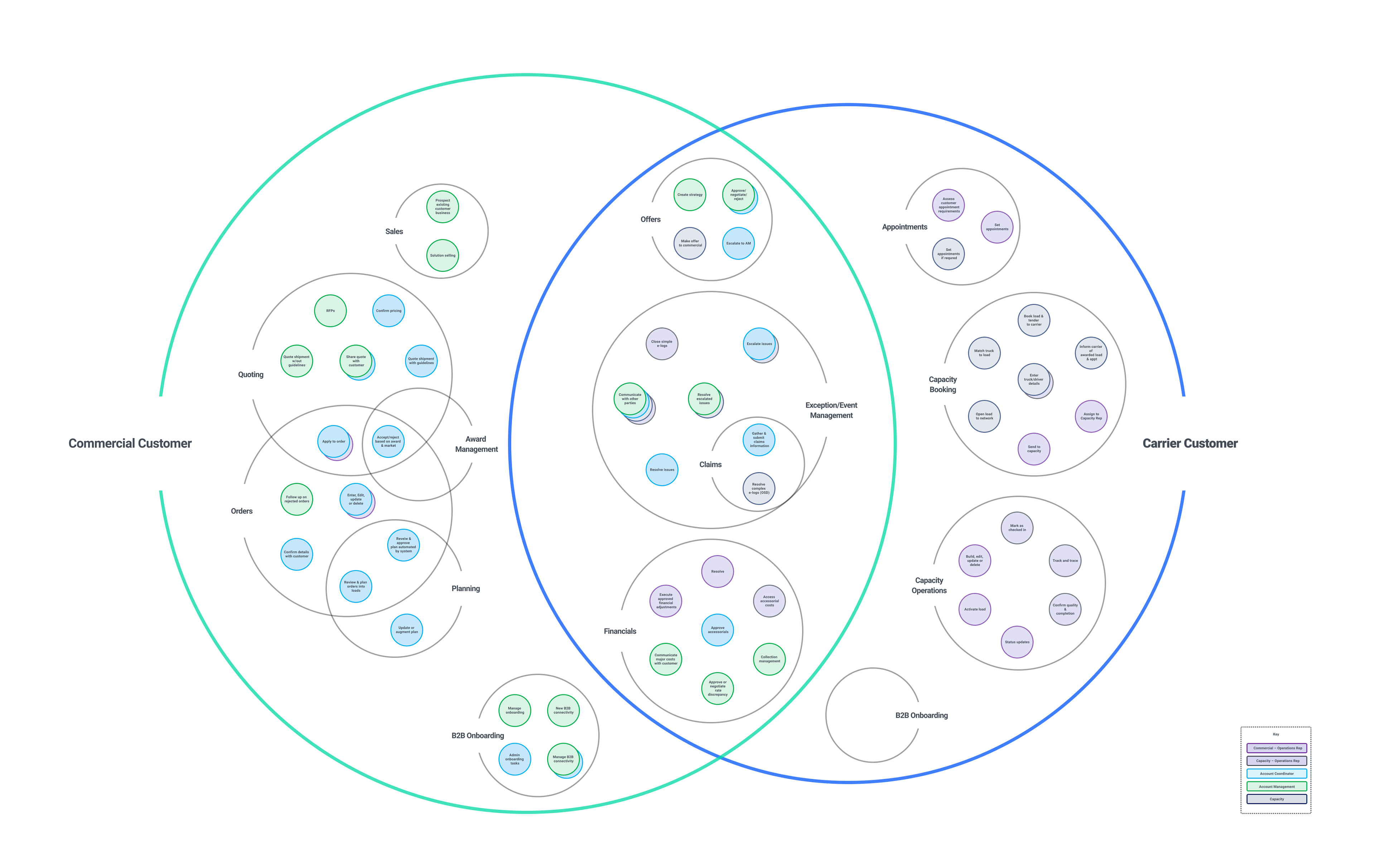
Tools and tasks through a customer-centric model
Here we have both the tools and their associated tasks aligned to the customer-centric concept model. This diagram helped me explain the intuitive approach I was proposing in a more concrete manner. My team and I were able to move forward together on wireframes with this model in mind, where by things may be organize more around the organizations and people we serve, versus the tools we use to serve them.
UX/IA Architecture
I had an intuitive design idea in mind of 'seeing the tools through the lens of the people the employees were serving.' I wasn't quite sure, however, where or how it would come to "live" in the global nav.
Sitemaps
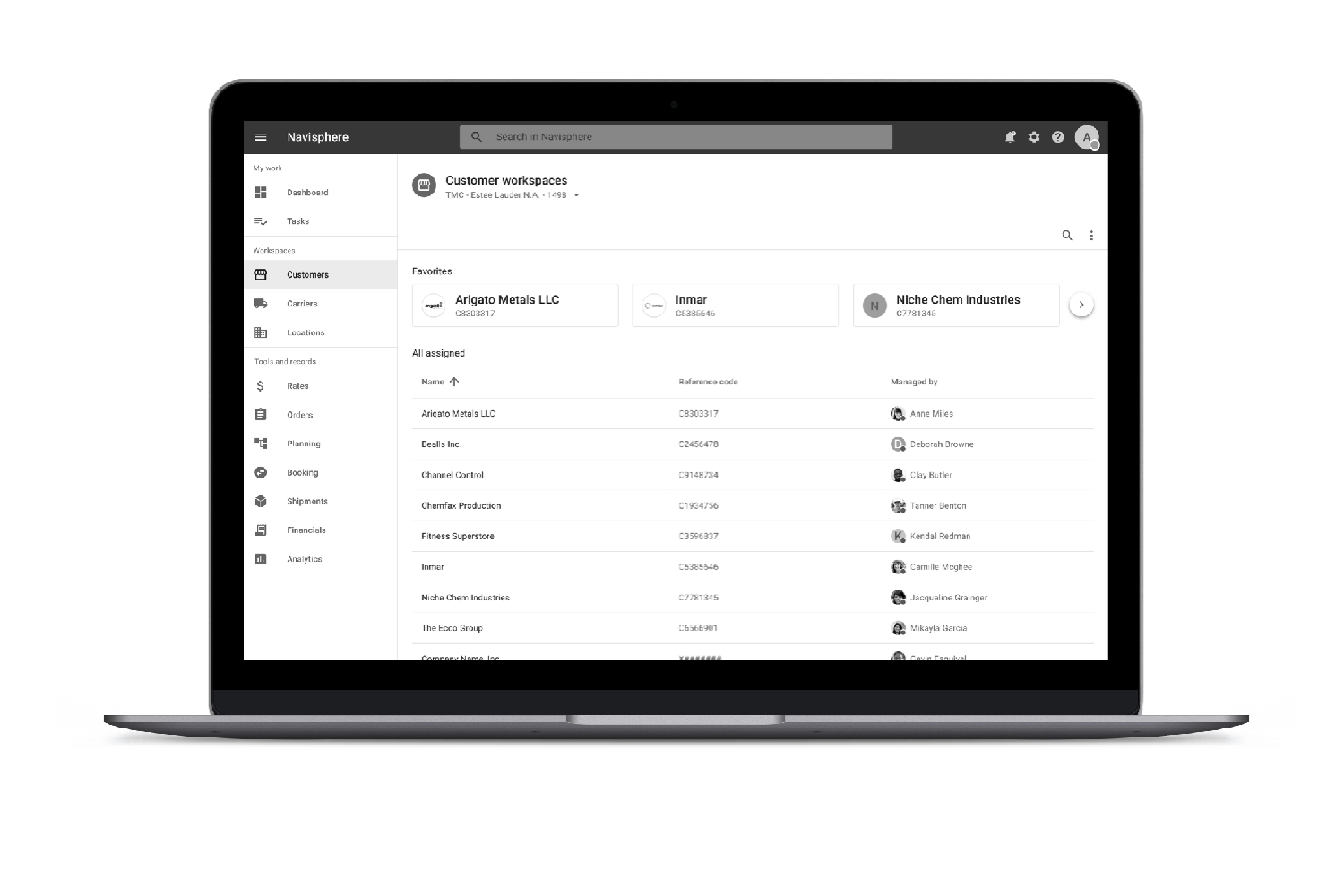
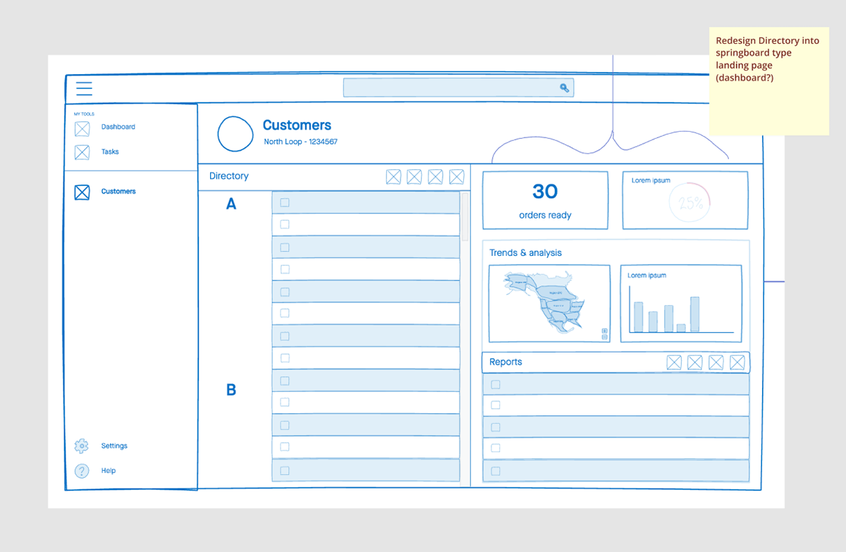
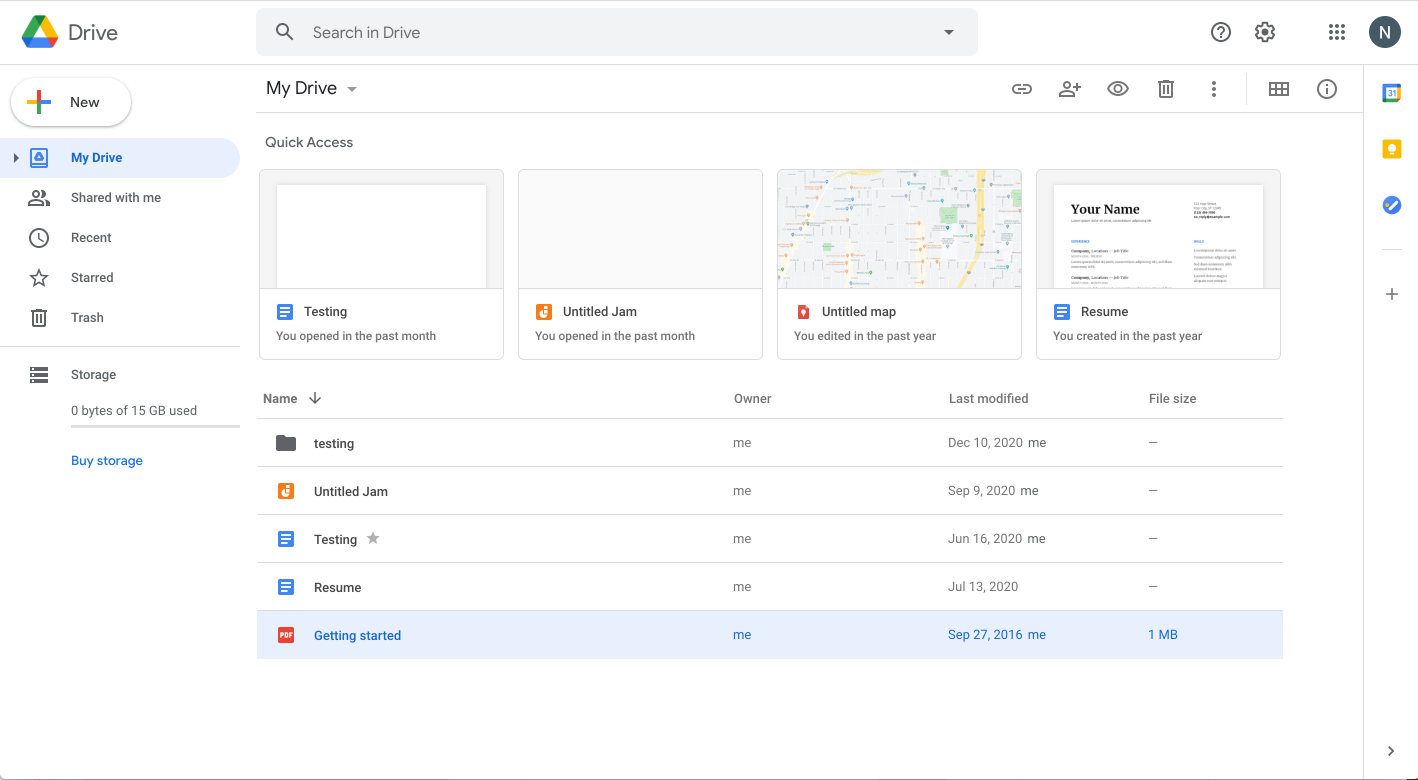
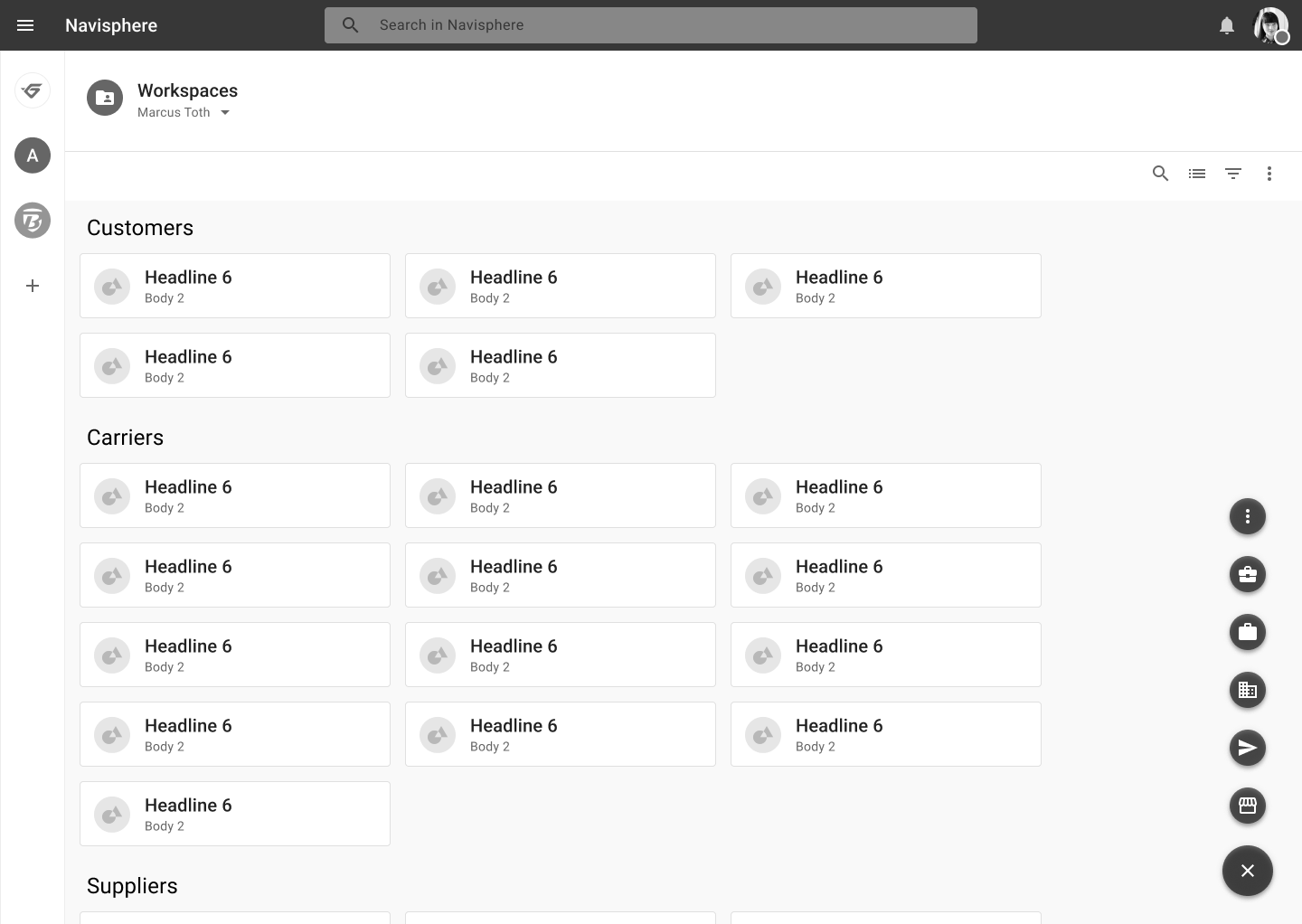
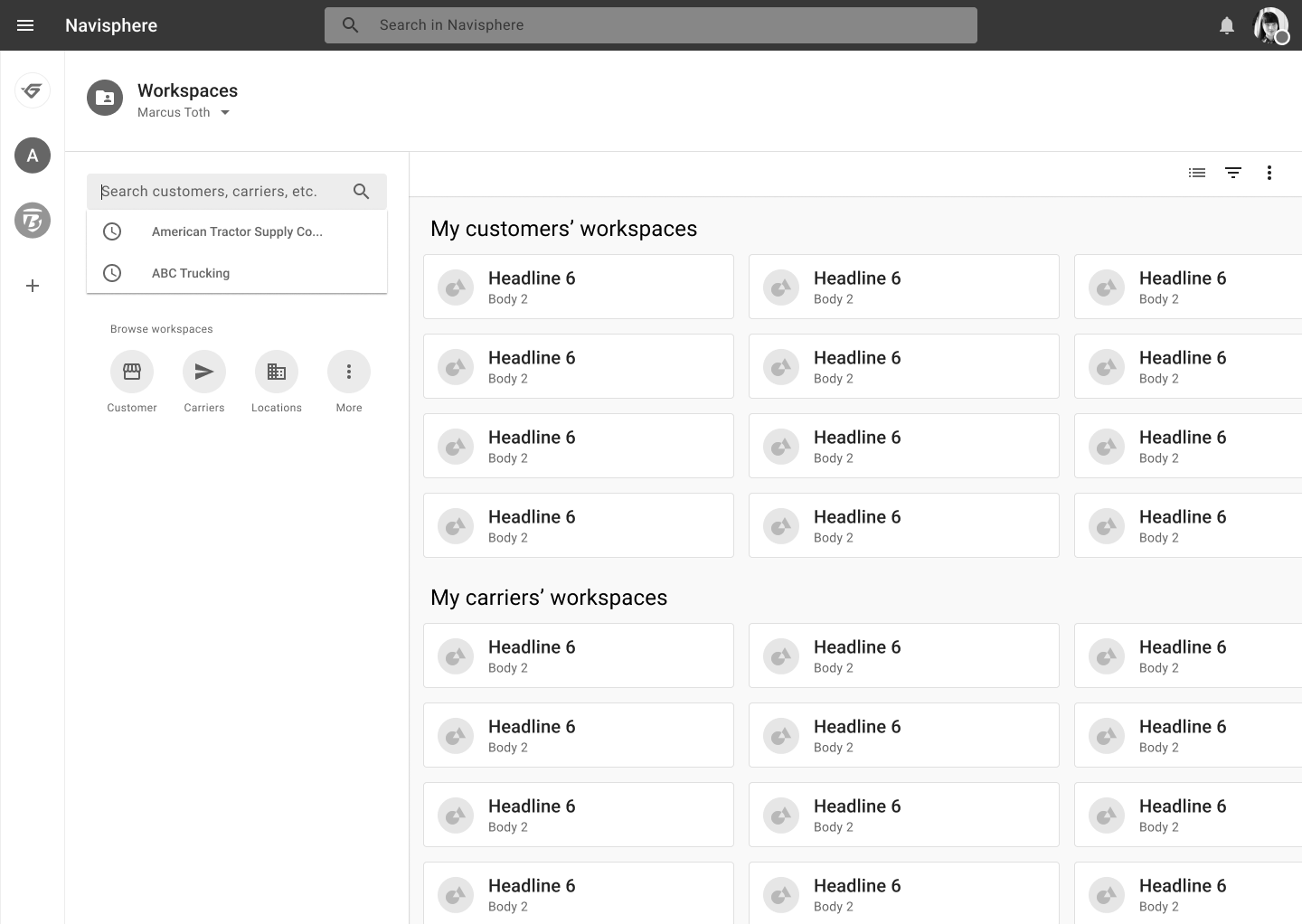
I suggested we create a sitemap to visualize how the new concept model would map to a navigation strategy. We created several sitemaps pertaining to each unique role and user stories we had written, which the navigation would need to support. This led me to the concepts of a "Directory" page led to a "Customer-specific (or carrier-specific) Workspace."
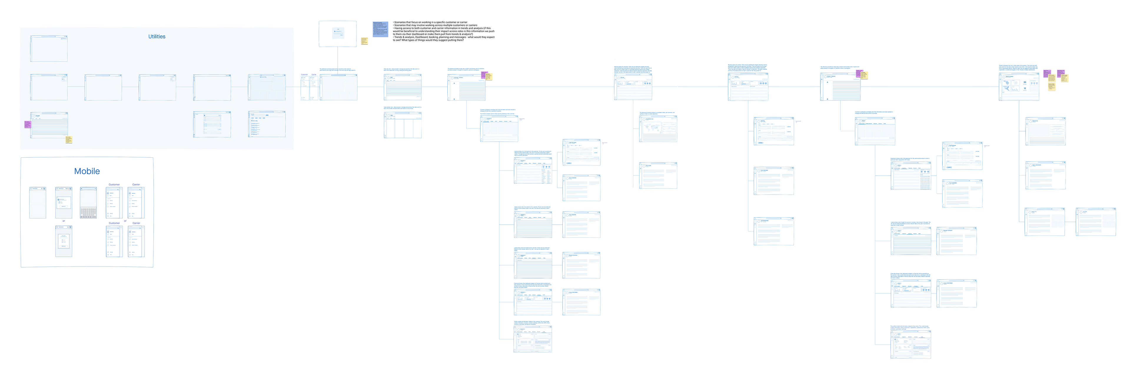
Wire-maps
Then, we created low-fi sketch wireframes to visualize the pages. This is where the concept if the customer-centric workspace really took shape.
Wire-flows
Lastly, we created a wire-flow to show how people were meant to navigate through the system.
Users enter the navigation drawer, go through to the directory, and reach their desired customer/carrier workspace. There, all of the related tools and records appear for that entity.
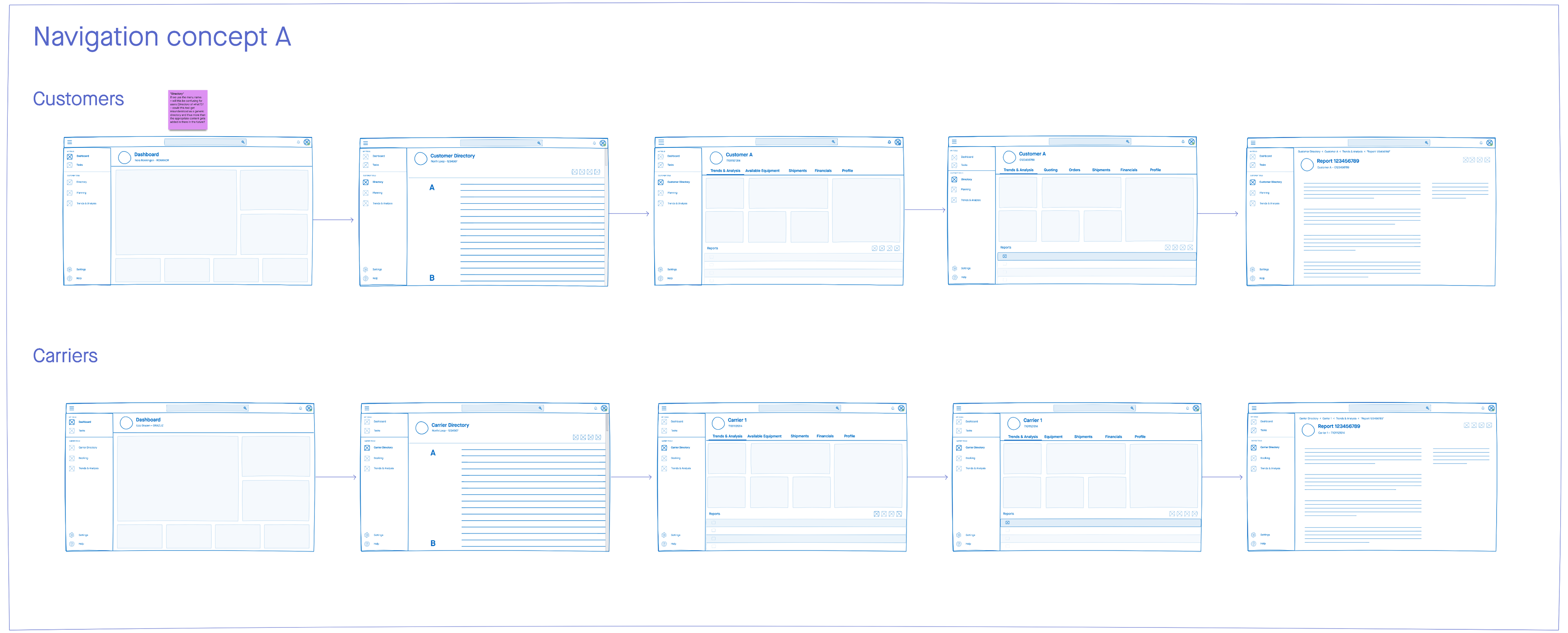
Customer & Carrier versions
Ultimately, we landed on two separate versions of the global navigation that we wanted to test with users. One customer-facing (left) and one carrier-facing (right).
Prototype one
As a team, we performed user testing and ethnographic interviews using two (customer and carrier) interactive prototypes to garner insights on the efficacy of our proposed nav. I proposed we utilize grayscale to avoid distracting the user with the UI design. Below is the customer prototype.
User testing
My team and I ran multiple rounds of user testing with real employee users of the current-state legacy system. We met with each user for about an hour to perform a variety of UX research methods.
Ethnographic interviews
The first half of each session was spent asking the participant to describe in their own words their first hand experience of their job. We asked questions regarding their tools and technology as well as their own background.
User testing
We showed each participant the prototype that corresponded to their job role and asked specific scenario-based questions. We asked them to complete the tasks using the prototype.
Research synthesis
Throughout both the ethnographic interviews and scenario-based user testing, we captured notes and screen recordings of the participants and their desktop.
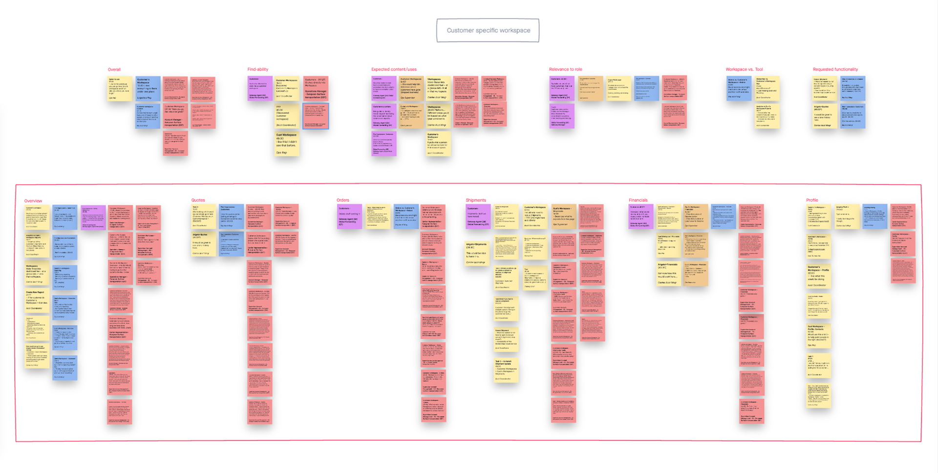
Affinity mapping
We used a spreadsheet to capture notes but found it cumbersome to sort into affinity mapping. Therefore, we transferred each note into a sticky, using InVision Freehand and sorted them into like groupings. Then we wrote high-level key takeaways that informed our design refinements.
Global navigation iterations
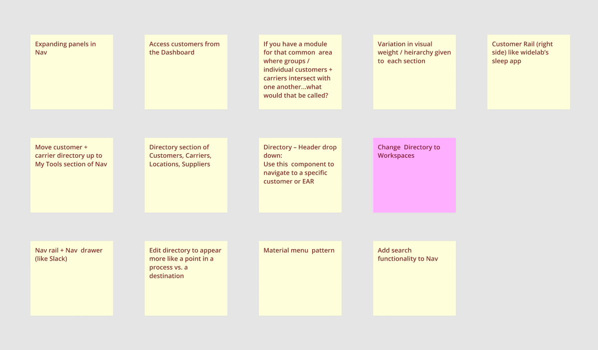
Ideation and mid-fi explorations
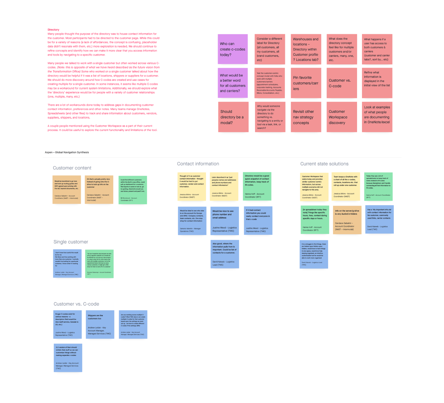
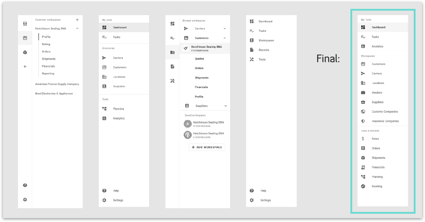
One of the key takeaways from user testing was that users have obvious difficulty discovering the customer workspaces. Where they "lived" in the hierarchy of the system buried them behind the Directory page, which listed out customers to choose from. Once people were able to reach workspaces, they were very excited about them. We knew we were onto something. We went back to the drawing board to ideate and iterate potential solutions that would surface the concept of a entity workspace in the global navigation drawer.
Inspiration samples
Working in Material provides a lot of flexibility in terms of facilitating quick iteration, providing building blocks to create unique components, and a vast array of inspiration source matter. These are some key samples and some of the iterations they inspired.
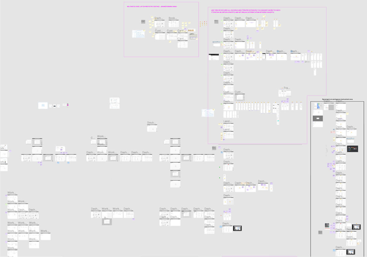
Final iterative results
We spent a lot of time going through iteration after iteration. We then stepped back to review what we had and "voted" on the viable concept. We saw a lot of conceptual repetition, which indicated that we needed to once again gather feedback from real users. We chose the most viable, scalable, and minimalist option and went forth to an additional round of user testing.
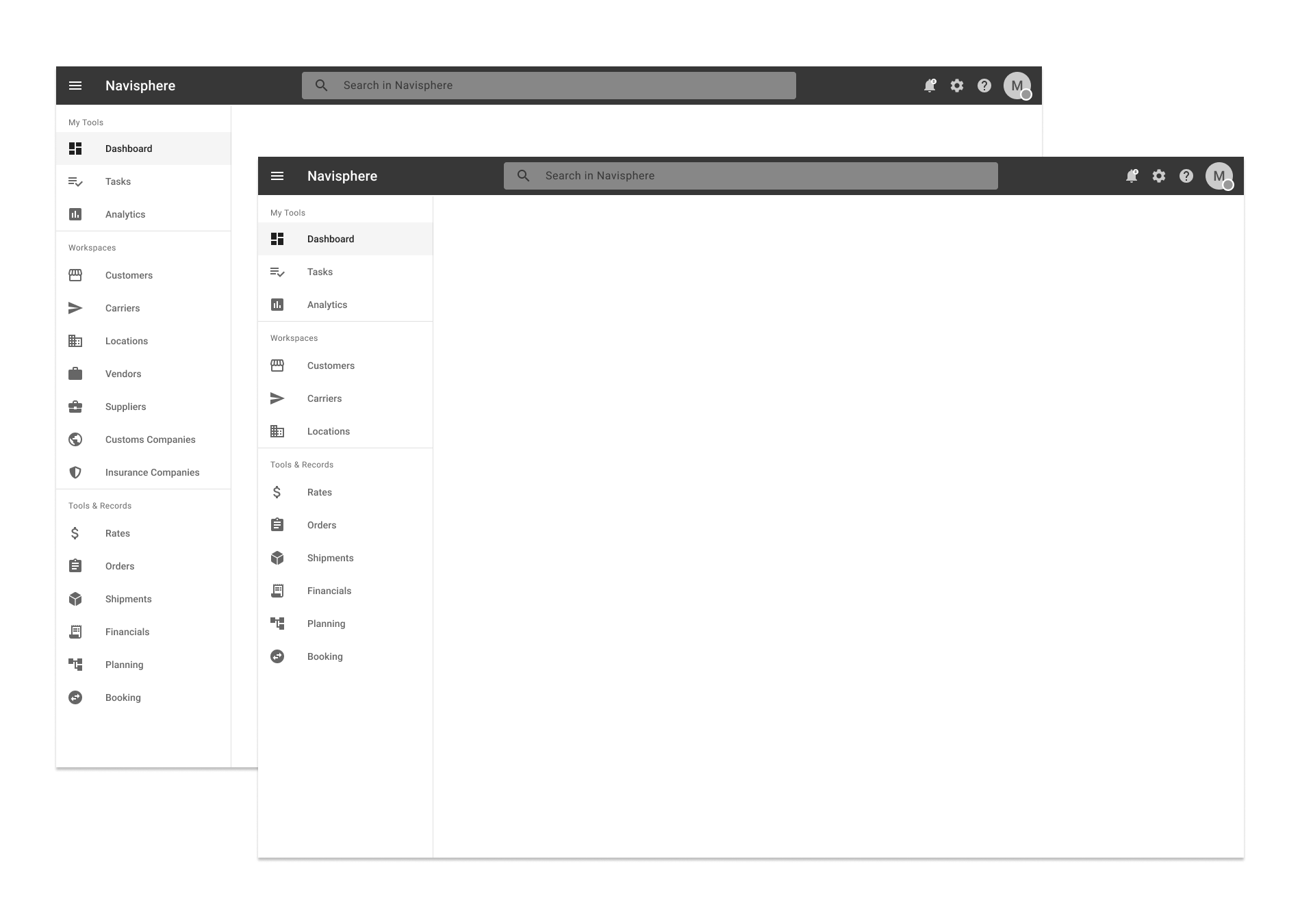
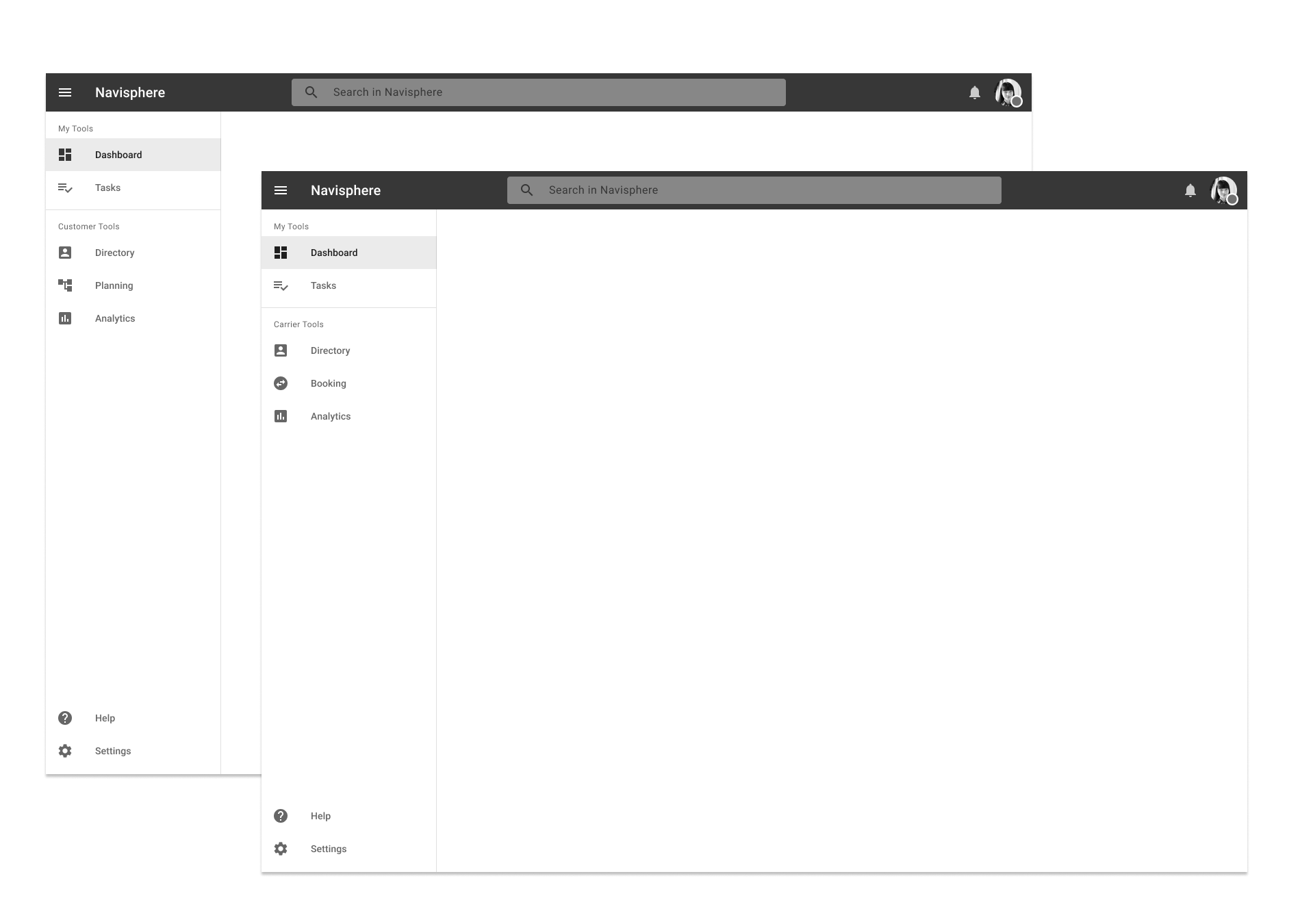
Prototype two
Similar to the initial navigation concept, this prototype has all of the tools surfaced again in the global navigation to show all records, regardless of related entity. It also presents key (customer, carrier, locations) workspaces. We implemented a simple log-in flow to help immerse participants and provide a more realistic feel.
User testing (round two)
In this round of testing, we expanded our test participation by meeting with people in multiple business lines. Our users also expanded geographically, residing locally, nationally, and abroad. Unlike the first prototype, this time we presented a single global navigation with all tools and workspaces. We tested all items in the global navigation and app bar areas.
Ethnographic interviews
The first half of this round of testing was also spent performing an ethnographic interview of our participants, regarding their job and background.
User testing
This round of testing again incorporated a broad set of scenario-based questions which participants completed using the prototype.
Research synthesis & affinity mapping
This time, we captured note taking via working directing with stickies in InVision Freehand. We were able to quickly transfer to affinity mapping, and notes were much more detailed this time (perhaps too detailed to be honest!). We also recorded participants and their desktops once again. From there, key takeaways were drawn and put into a presentation.
Outcomes
13 Billion
Employee experience, the first of many arms of the new Navisphere platform, is projected to save C.H. Robinson at least 13 Billion dollars.
Streamlined experience
No more confusing, dated, intricate, or broken tools. We devised a simple and user-friendly interface with consistent hierarchy across all tools, for all personas to enjoy.
Workspaces
I was able to strategize and design an entirely new concept called Customer-centric Workspaces which served to organize all related tools and records around a specific entity, such as an individual business.