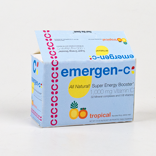
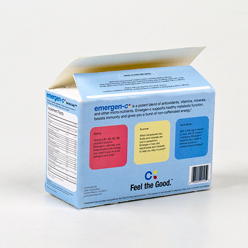
Emergen-c is a great example of a good product with not so good packaging design. This updated design refreshes the brand’s look and feel to better represent the healthy product they offer. Emergen-c is sold in boxes of individual packets which are meant to be mixed with water, creating a yummy, sparkling vitamin supplement drink.
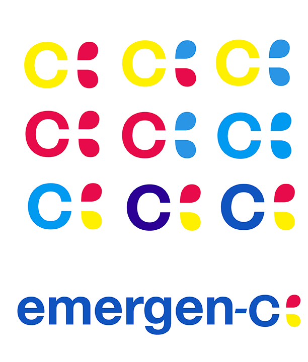
The new “c” logo is a much needed, refreshing improvement on the previous comic book-inspired “pow” design. The new logo creates the shape of a red-cross icon in its negative space, and the pink and yellow droplet shapes imply a juicy, fun beverage.
The overall packaging design is meant to stand out on the shelf and elevate the brand to enjoy the same trustworthiness of science and medicine, without making those direct claims in its copywriting. The fruit icons in the identity system, as well as the color of the “c” logo pattern, change to represent each flavor. The packaging is die-cut to detach on the narrow top-side for easy and effective individual packet sale on retail end-caps.