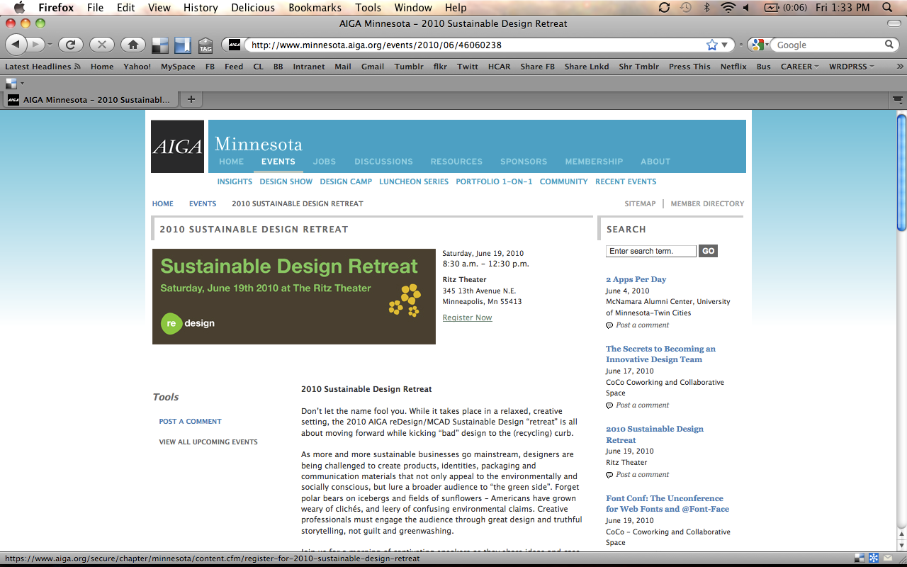
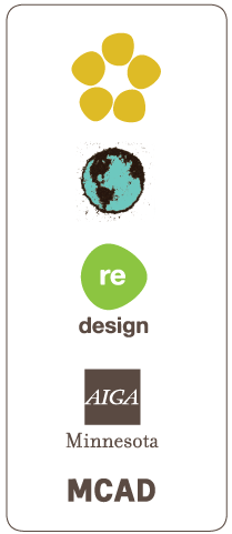
This is a brand and style guide I created for an event put on by a sustainable design committee in AIGA Minnesota called reDesign. The event was called the 2010 Sustainable Design Retreat. Using my expertise in color psychology, I chose colors that suggest earth, food, water, and the future of the green movement. I designed a new logo for the event, using the official reDesign logo to form a new icon that implies a flower garnish. I also designed other branded deliverables for the event, including the podium banner, name tags, flyers, gift tags, web banners, email marketing design, and an event thumbnail icon.
My process in this project included both a research phase (documenting inspiration and ideas) and an experimentation phase. During experimentation, I used coffee grounds and other materials with a scanner, producing original assets for the event’s brand design. A couple members of the committee and I silkscreen printed the official poster for this event, using 70% post-consumer recycled paper (donated by Neenah).
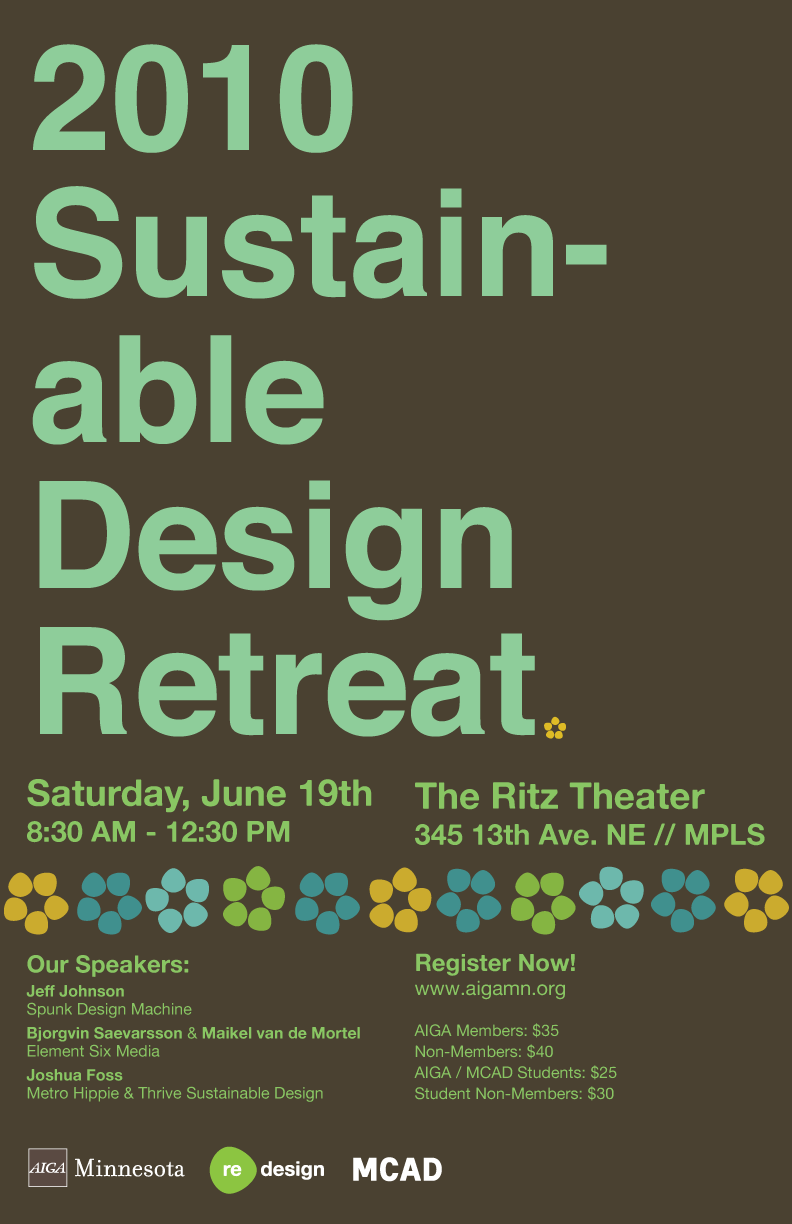
Screen printed poster design

Icons made from coffee grounds (and a scanner)
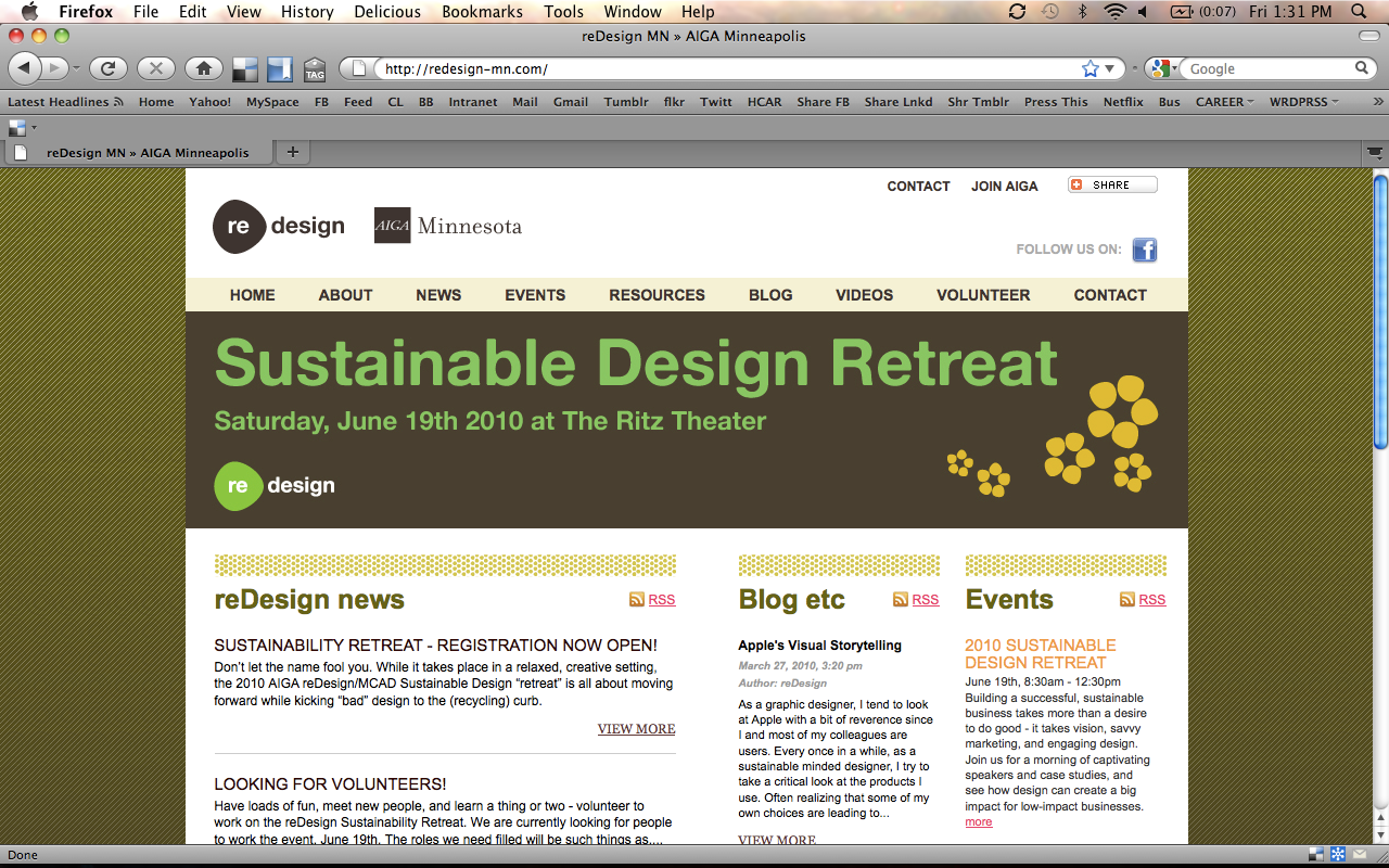
Web annoucements
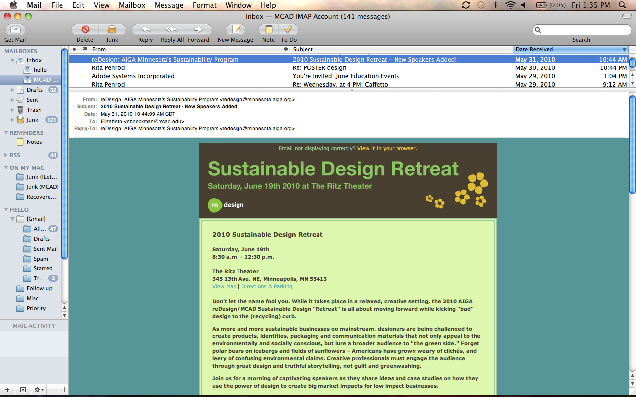
Customized email announcement


Custom event colors
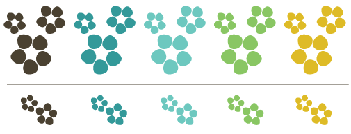
Flower event logo, produced from reDesign logo


Name tags
Podium banner

Process shot and mood board scans